Never judge a game by its box art? Sure, that?s true, but making box art for a game can be an art in itself, and sometimes the artists come up with some fantastic pieces.? So why shouldn?t we sit back and admire the covers of our games? I would like to take a moment of your time today to share a collection of the coolest and lamest box art that has graced our senses.
Wicked Awesome Box Art
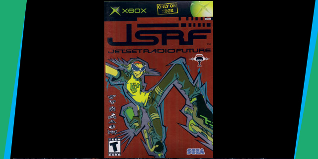
Jet Set Radio Future
It?s cool, it?s hip and would you look at that, it?s holographic. This game?s box art is as funky fresh as the content within. Done in a graffiti-like style, this cover does a fantastic job of explaining what living in JSRF?s world entails, and with the game?s eye-catching aesthetic, it was important that they nail the feel on the front of the case as well.
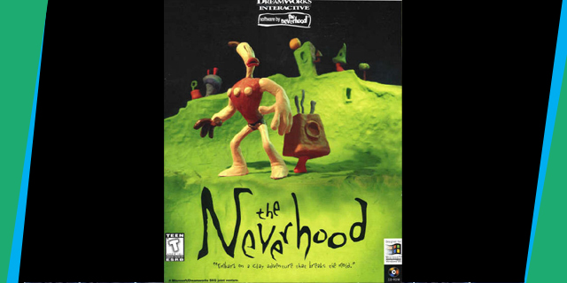
The Neverhood
The Neverhood was conceived back when using corny tag lines like ?embark on a clay adventure that breaks the mold? was still an acceptable practice. The Neverhood box art exudes bizarreness. Using the unique clay-animation style contained within the game itself, this cover really pops out among the others of its time. A photo of a ?claymation? figure is bound to grab your attention amongst all of the hand-drawn and digitally-rendered covers out there.
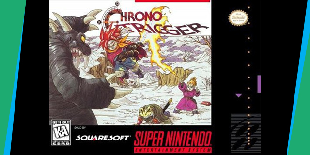
Chrono Trigger
Still as visually striking as it was nearly 15 years ago. Akira Toriyama?s art is instantly recognizable, and between Blue Dragon, the Dragon Quest (Warrior) series and the multitude of Dragon Ball Z games out there,? Chrono Trigger?s still stands out as his best work. While most RPG cover art is satisfied with introducing us to the games? central characters, Chrono Trigger wants to show them kicking ass and taking names. That Heckran is so totally boned.
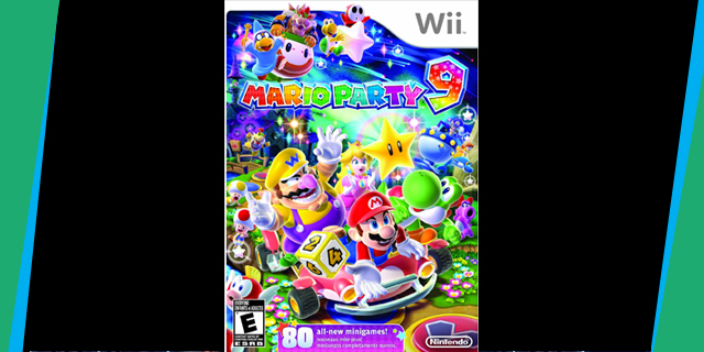
Mario Party 9
Being this colorful is almost a crime, but somehow Mario Party 9?s graphic designer pulled it off. The use of softer pastel colors was certainly a good choice here, as no one wants to burn out their retinas before they spend all day staring at the TV screen. This cover is fun, and that?s all that needs to be said here.
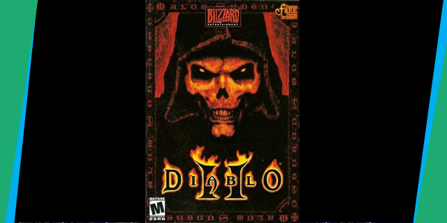
Diablo II
Blizzard Entertainment has an impressive track record when it comes to art in general, so it should be no surprise that their box art is great. Out of all of the games they have released, Diablo II still holds the crown as their most visually-striking piece.? The cover oozes sinister, and it really sets the tone for the actual game. Unfortunately, the travesty that is the Diablo Battle Chest has made it harder to appreciate this piece.
?
Wicked Awful Box Art
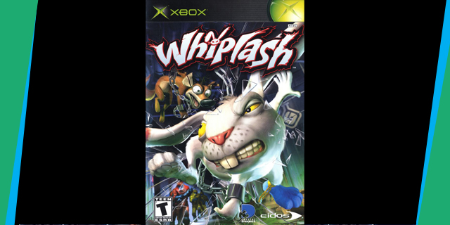
Whiplash
Okay, so Whiplash is a funny concept. I won?t contest that, but this game came out at a time where animal mascots were terribly pass? and these two don?t exactly stand out as interesting designs from a visual standpoint. I think the whole thing was also marred by Microsoft?s terrible decision to have their green logos so large on the front of the game (though the same cover was used on the PS2 release, and was still awful). This cover is just ugly.
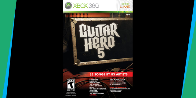
Guitar Hero 5
No way! This game has famous artists in it!? Thanks for filling a third of the box space with information that should have been on the back of the case, Activision! Speaking of cases, they must have decided it would be meta to have a Guitar Hero 5 case have a Guitar Hero 5 case on the front. It?s not the worst box art in the world, but it certainly is not the most exciting.
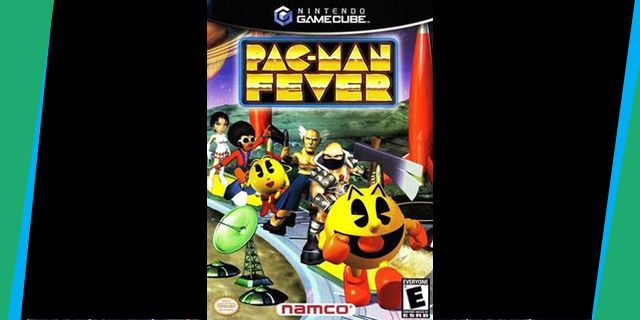
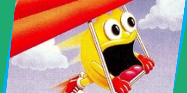
Pac-Man Fever
I love the Pac-Man Fever cast as much as the next guy, but that doesn?t mean they look good together in any situation. That?s especially true when they are going to use awful in-game model renders.? It?s actually fairly horrifying seeing Pac-mMan party it up with midget Astaroth, and what are those things in the bottom left corner? Landmines?? Snack platters?
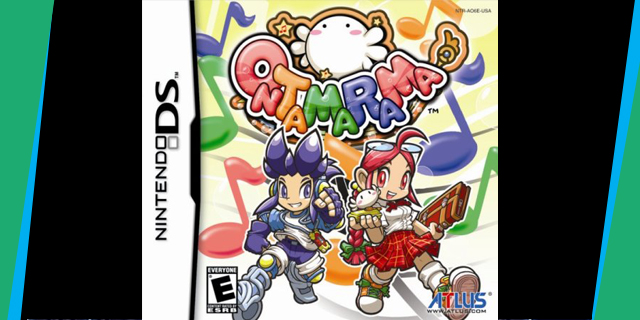
Ontamarama
Okay, I?m not sure if I am in the right age group to enjoy this game (though the game is too hard to be for younger children), but I can?t get over the terrible character designs in it. The front of the box would have been better off just having the background and the logo. The logo itself is pretty vivid, but they had to go and screw it up by adding the travesties that are Beat and Rest. I?m still surprised this had a U.S. release.
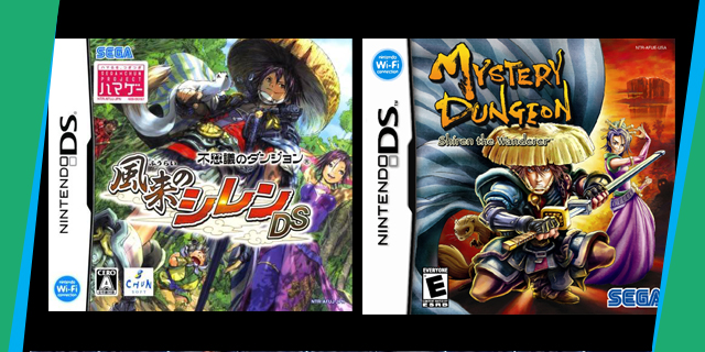
Mystery Dungeon: Shiren the Wanderer
On the left: The Japanese box art for Mystery Dungeon: Shiren the Wanderer. On the right: The North American box art. Which one could I possibly be talking about? Just thinking about this game?s cover leaves a bad taste in my mouth.
Art is a subjective topic. Do you agree with these choices? Care to share some of your own favorites? Drop us a line! Comments are always appreciated.
Source: http://www.snackbar-games.com/features/top-tier-for-better-or-worse-ten-radical-box-arts/
khloe kardashian mark davis marine urination video hostess cadillac ats bain capital marines urinating
No comments:
Post a Comment